The Evolution of Famous Czech Logos
Are you looking at your company’s logo and noticing it doesn’t have the same spark as it had when you created it? It can be little outdated or just boring. Maybe it’s time to change.
The company’s logo helps people to find and identify your business; it is a way for them to picture your company. The right logo has to suit your business, be unforgettable and still simple. You should be careful about the design because the change can have positive as well as negative impact on your company.
A new logo represents that your company is on the move, does not stagnate. With changing the logo, you are saying that your company is open to change and making progress.
On the other hand, there is the possibility that your audience won’t like new logo as much as the previous one. Therefore, you don’t need big changes or completely redesign your logo; sometimes just changing the colours makes it fresher.
Watch out; if you change company’s logo too often, clients can lose track and won’t identify your business with the logo anymore. So consider your situation and if needed, go ahead and renew the logo .
Here we have some inspiration and examples of the evolution of logos in famous Czech companies:
Czech Airlines

Česká televize

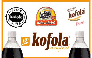
Kofola

Orion

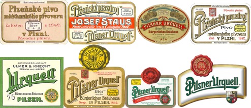
PilsnerUrquell

Hamé

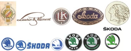
Škoda

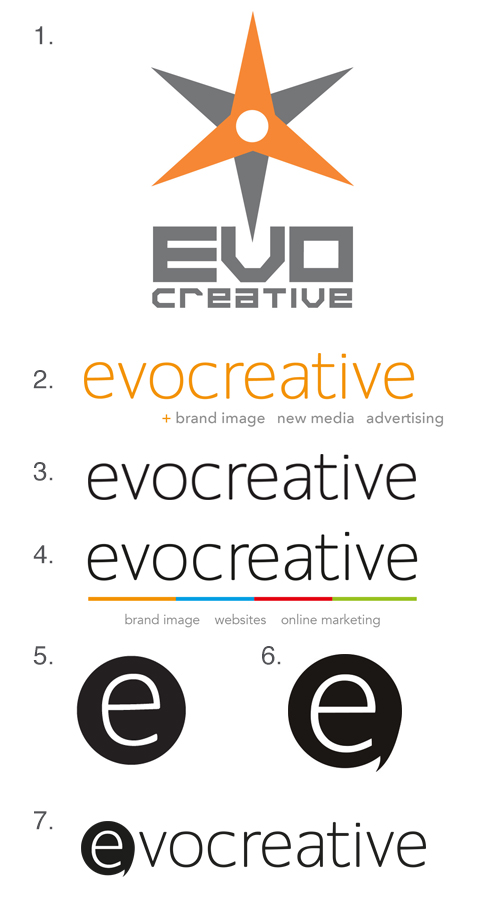
And here is the evolution of our very own logo


