Countries as a Brand…and a Logo is a Necessary Part of It
All products have a distinct visual image, with some companies boasting a proud, long-term brand identity, recognizable all over the world (you can see the development of some modern-day logos in our previous blog post here ). But not only companies develop their own logos. For countries, logos are also important in order to boost their tourism industry and attract investors. Within a modern world of advanced technology and online presence , marketing is even more competitive, with countries being no exception.
Logos are part of a country’s identity. To be successful in creating a strong brand, a logo needs to be positively accepted by the local population. It has to be clear what each logo represents and why, as well as establish a direct connection to the country (which is probably not a big surprise). Last but not least, the logo should be supported and used by all important channels at all levels (tourist agency, government, local councils etc.) in order for the tone of the message that the country spreads to be clear and united.
Let´s have a look at some examples of country brands.
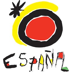
Spain is considered to have one of the most successful logos. The author of the logo is famous Spanish artist, Joan Miro, who is well-known for using bright colours and playful shapes. The design was introduced in 1984 when Spain needed to distance themselves from the violent and repressive image of the recent Franco era. To present the country as reborn, optimistic and welcoming was the main aim. Since then, it has become one of the most recognizable logos in the world and has developed the strong support of the Spanish people.

The second sample was introduced quite recently, in 2010. Boosted by a growing economy and positive changes that were happing within the in country, Peru felt an opportunity to develop a new branding image. This new logo of Peru is simple and at first glance it might be difficult to read the text (compared to Spain for example).The first letter, P, is the dominant character of the logo and is inspired by the graphic motives that can be found in the famous Nazca lines ( as you can see in the image displayed). This represents the transformation, change and evolution of Peru. However, this isn’t the only thing that the letter P represents. According to an official statement, the first character also “evokes a fingerprint, in line with the concept that “There is Peru for everyone””. The rest of the logo has also a meaning; “We chose handwritten script, an unbroken line that transmits the idea that everyone will draw their own route based upon their special interests.“
What do you think, does the image of a fingerprint come to mind?

Here are some more samples of well recognizable trademarks, which are used by countries for wider use or mainly for tourism purposes:


